Now, more than ever, every experience counts.
We want to share our experiences with others and bring our offline and online worlds together.
OVERVIEW
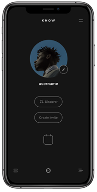
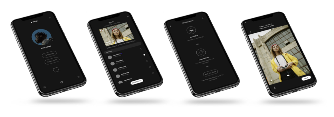
Know is a native iOS app for hosting and attending events. My team was recruited to add RSVP features and payment platform integration.
TEAMMATES
Briana Barkman, Katherine Chester, Ryan Massenzio
ROLE
UX Research, UX Design, UX Strategy
METHODS
Screener Surveys, User Interviews, Affinity Mapping, Persona Development, Journey Mapping, Problem Statement, Design Studio, Sketching, Wireframes, Prototypes, Usability Testing
REMEMBER WHEN WE WENT TO REAL EVENTS?
We partnered with Know App creators in early March 2020. Know began as an app for hosting or attending events. Launched with a camera-first approach, it would allow users to easily create, send, and receive invites as video content. We were brought in to improve creation and management of events by adding RSVP features and a payment platform integration, focusing on users who host events often and are active on social media. A global pandemic forced in-person experiences to take a back seat, for a while.
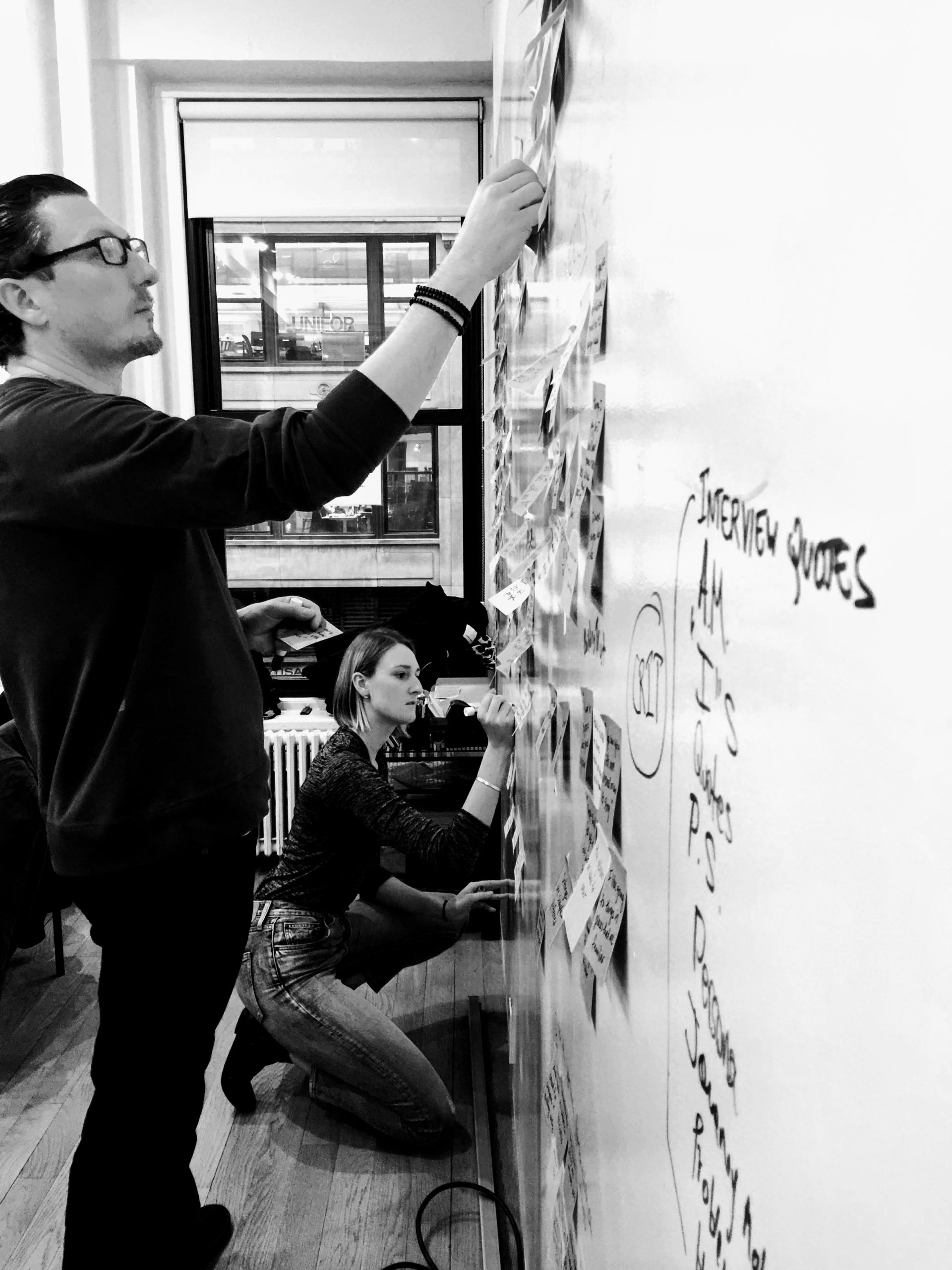
Affinity Mapping
CHALLENGE: THE PUSH-PULL OF SOCIAL EXPERIENCES
From 12 survey respondents, we interviewed 3 women and 3 men, ages 21-50s, to understand how they discover, plan, and share events. This data would inform designs for our new features.
Interview data showed users:
● Share invites via word of mouth, social media, email, DM
● Learn of events via word of mouth, Instagram, email, DM, venue and performer sites
● Get tickets thru Eventbrite, Ticketmaster, Bandsintown, venue and performer sites.
I noted a creative energy in our target audience, a desire to be:
● Inclusive, but exclusive
● Spontaneous, but planned
● Public, but intimate.
Users prefer intimate invites because they're easier and more personal. But spontaneity is hard to plan. You don’t know who or how many will come to your event.
We had to run with these dynamics and not lose them. Our persona, Frankie, embodies the dual desires of this online/offline style.
PERSONA: Frankie, age 30, Lower East Side, NYC
BEHAVIORS: connects via social media, word of mouth
GOALS: wants friends to feel like VIPs, VIPs to feel like friends
NEEDS: create a fun, personal experience online and off
PAIN POINTS: doesn't know how many will attend her events
SCENARIO: Frankie wants to host an event to promote her work, but finds it hard to plan and share the event with her followers.
PROBLEM STATEMENT
Event hosts want to connect with their audience in intimate ways.
Frankie is a creative entrepreneur who wants to host events that will build her brand and strengthen her personal connections.
How might we help Frankie reach her audience, maximize attendance at her events, and uphold her brand?
THE EXPERIENCE GOES ON
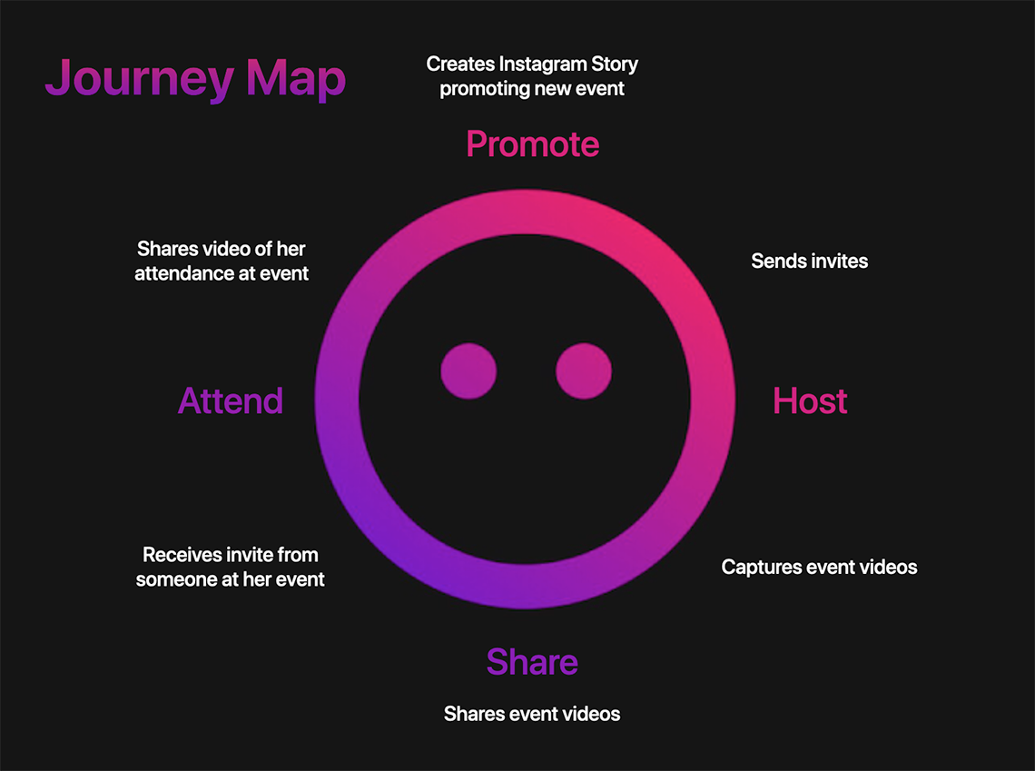
To illustrate the ongoing, cyclical nature of Frankie's event experiences, I created a continuous journey map, with each phase leading to the next. (See a fuller journey map here.)
PROCESS: DESIGN DYNAMICS
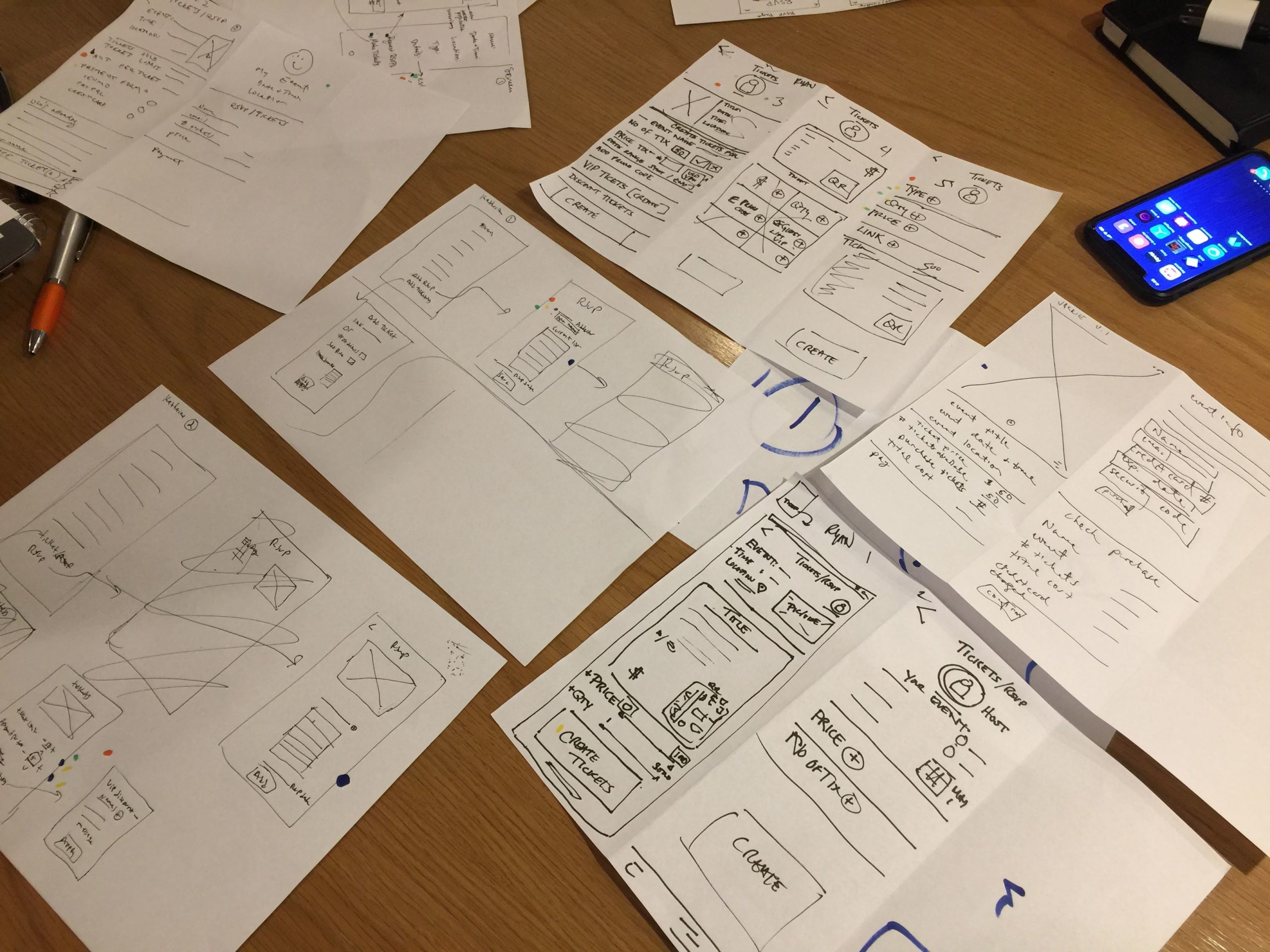
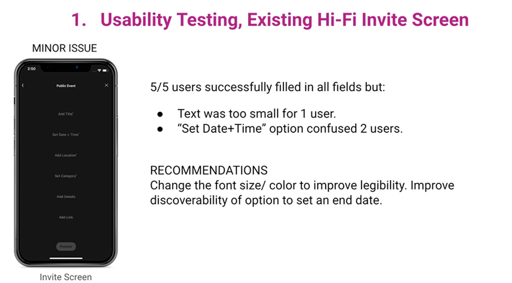
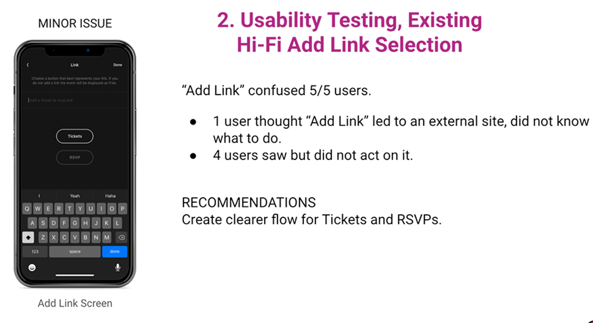
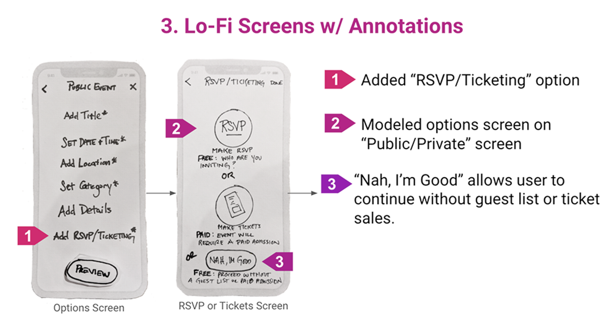
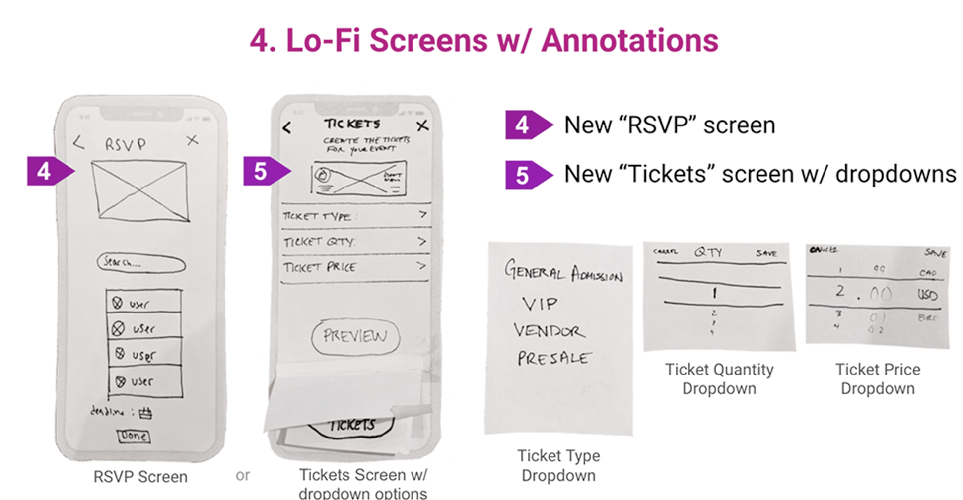
Usability tests of existing invite and RSVP screens revealed minor issues with text legibility and the meaning of some terms and icons. Through design studios, we created clearer task flows and affordances while retaining the app's spontaneity.
Design Studio
NEXT STEPS
Modify slider in Public Invite screen for a more effective signifier.
Increase font size and modify contrast for legibility and accessibility.
Re-word calls to action for more effective signifiers.
Create second persona and user flow for event attendee.
Test usability of onboarding video.
LEARNINGS
Small changes, like a term or icon, can make a huge difference in a product beautifully designed. Font and color adjustments make that product accessible, engaging, and usable to many more users.
The cyclical journey map captures the continuous user involvement this app fosters. Does Know also support an outward engagement essential for creativity and community?
COVID-19 hit in the middle of our work, and in person went remote. Know evolved to become The Social Experience Network, a guide to Instagram live content and online virtual events. Our work also evolved. We presented our deliverables as requested. Opportunities abound for Know's next phase.
