ArcGIS web map
Spreading the word about special places is tricky.
How might we share beautiful locations online now to protect them for the future?
OVERVIEW
I was recruited by a land conservancy to update its website for a broader, more inclusive target audience. Attracting new donors would be OK, too.
ROLE
UX research, UX design, UX strategy, Web design
METHODS
Competitive Analysis/Feature Comparison, Current & Revised Site Maps, User Interviews, Affinity Mapping, Persona Development, Journey Map, Wireframes, Figma Prototype, Usability Tests
Research content management systems, site design themes, hosting services, page builders, plugins.
CHALLENGE: CHANGING PRIORITIES, MIXED EMOTIONS
Dynamics between virtual and physical space evolved throughout my work. Essentially, I collaborated remotely to design a virtual experience of the spatial and physical nature of a real place to a new online audience.
I also addressed desires of stakeholders who are dedicated to their mission as they seek a target audience with no prior knowledge of the organization's work.
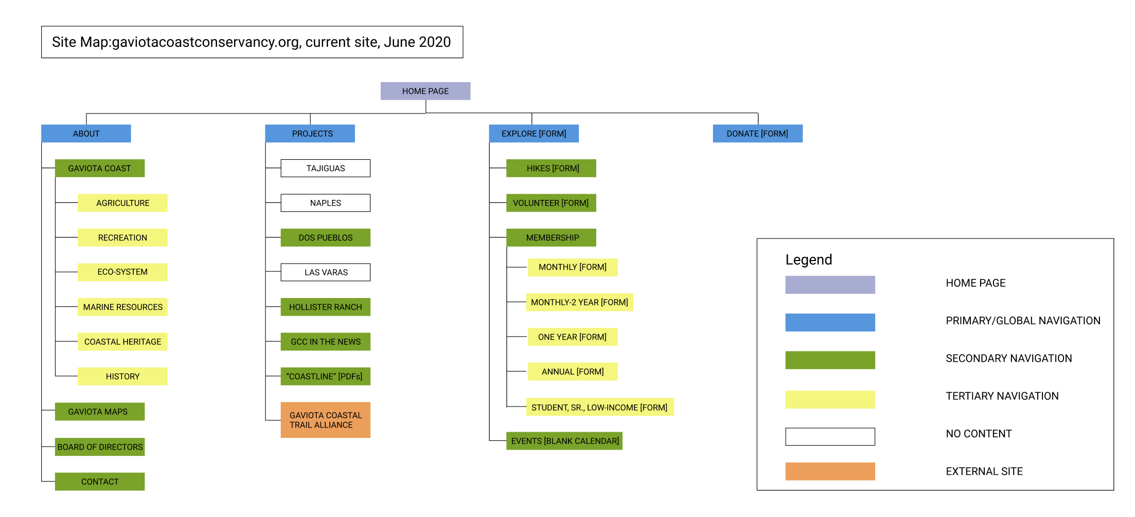
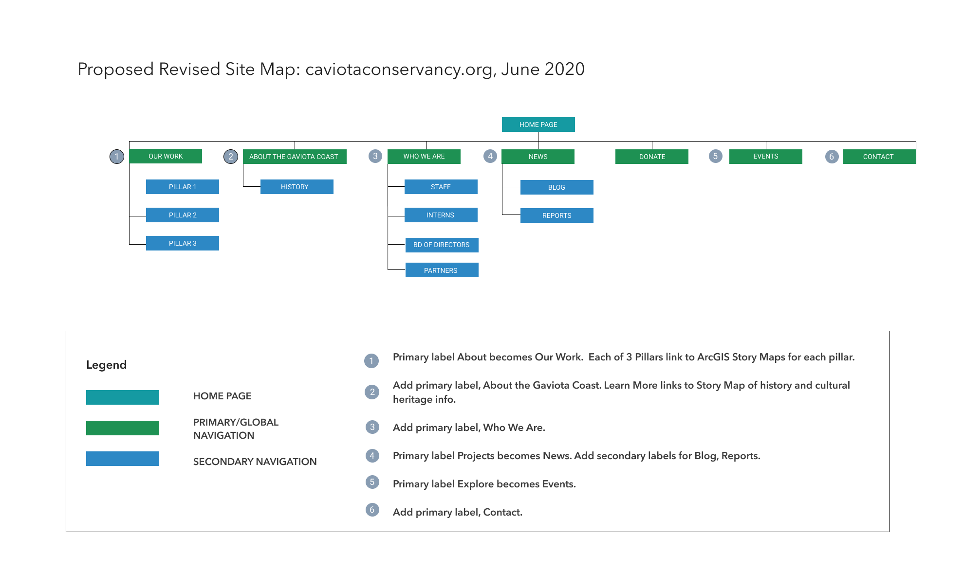
First step: create visual sitemaps of the current site and a revised one to help users find information with a streamlined navigation.
PROCESS: GETTING THE LAY OF THE LAND
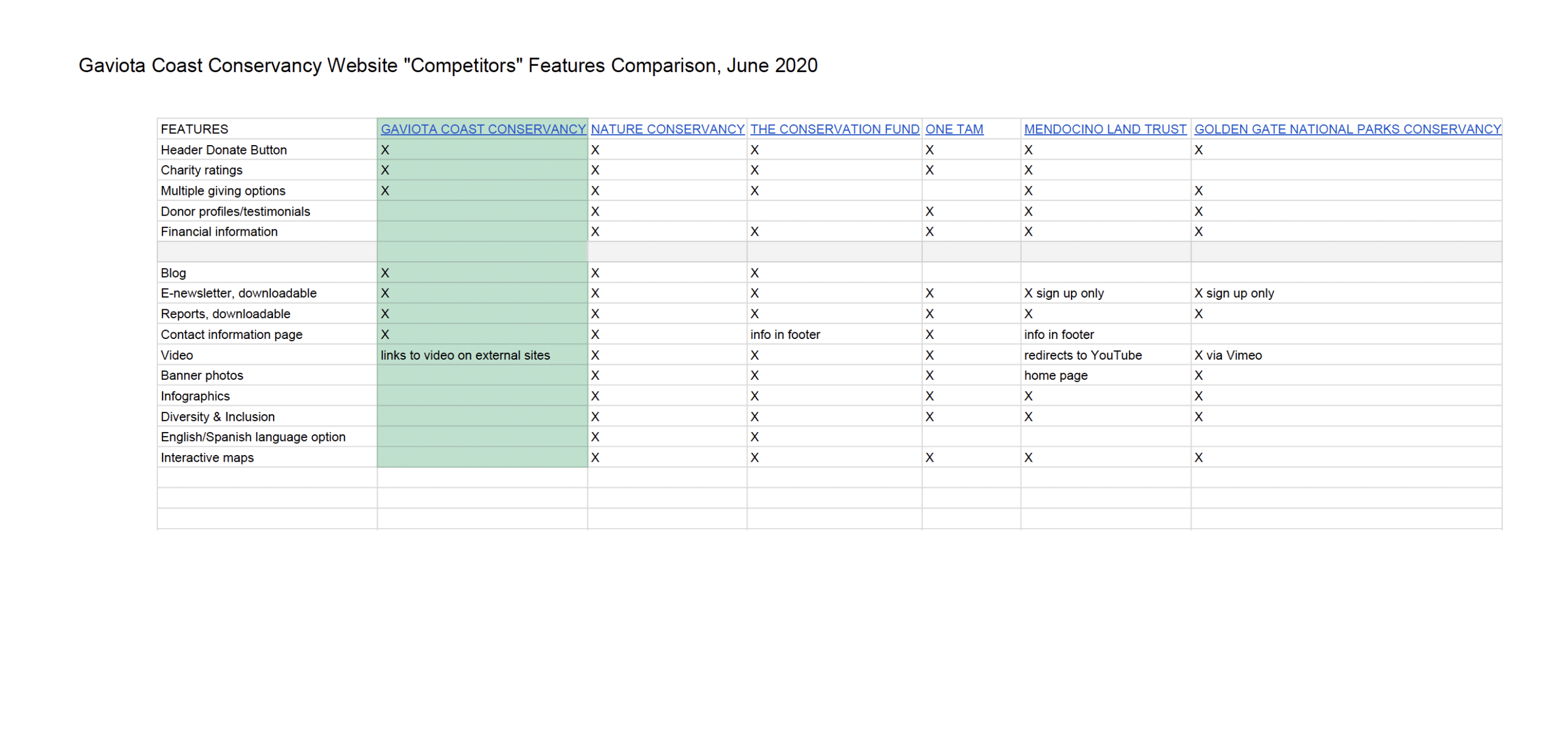
A competitive analysis and feature comparison yielded valuable data:
- Key features of comparable organizations
- What's missing from the client's current site
- Opportunities to improve on competitors' features
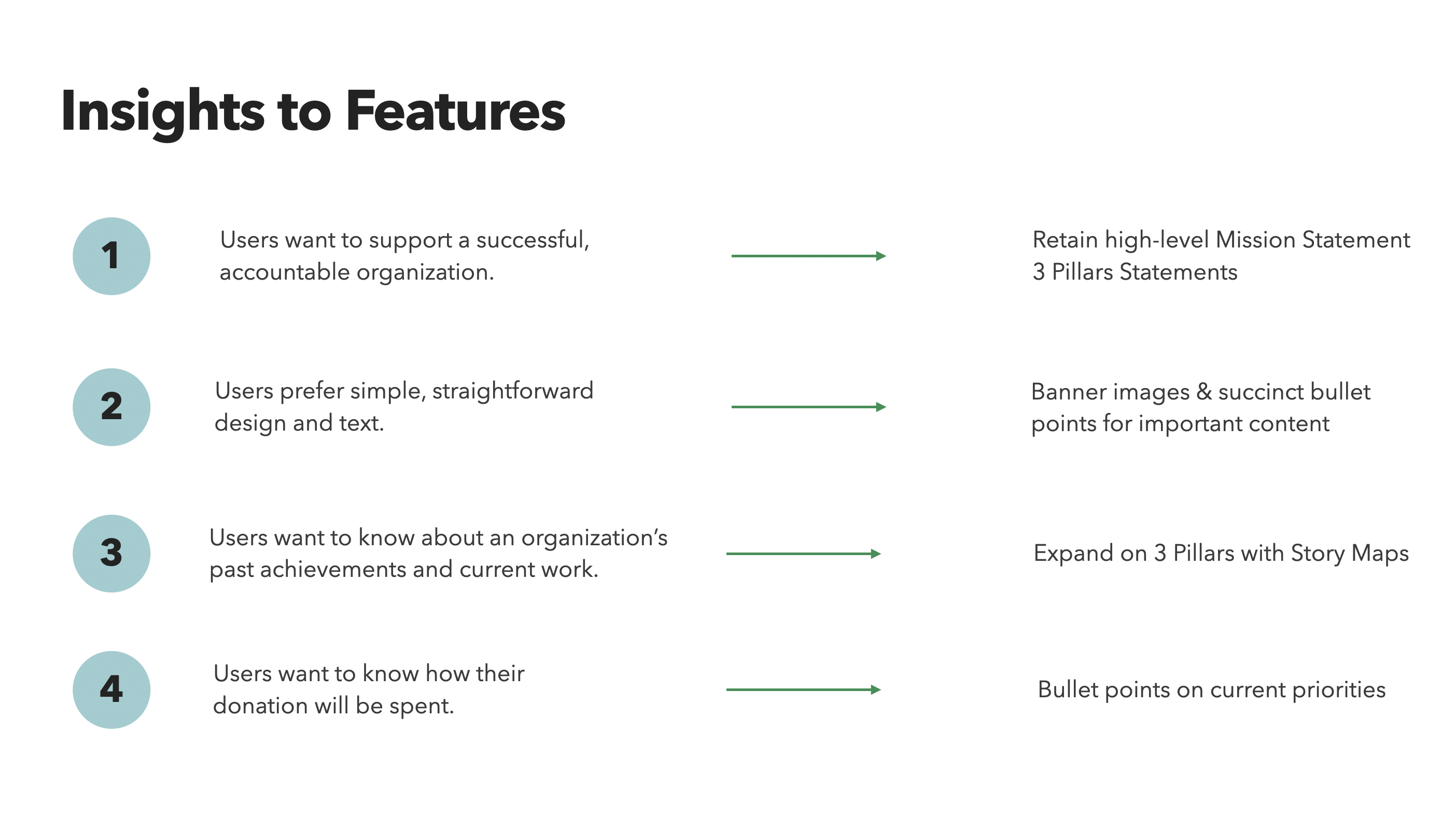
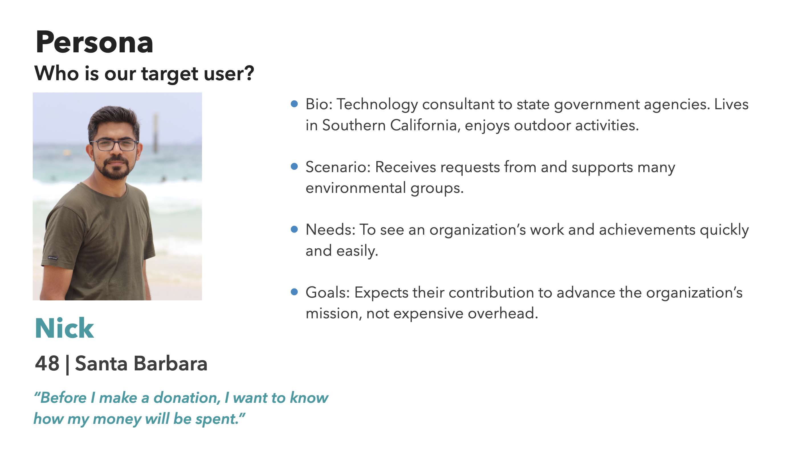
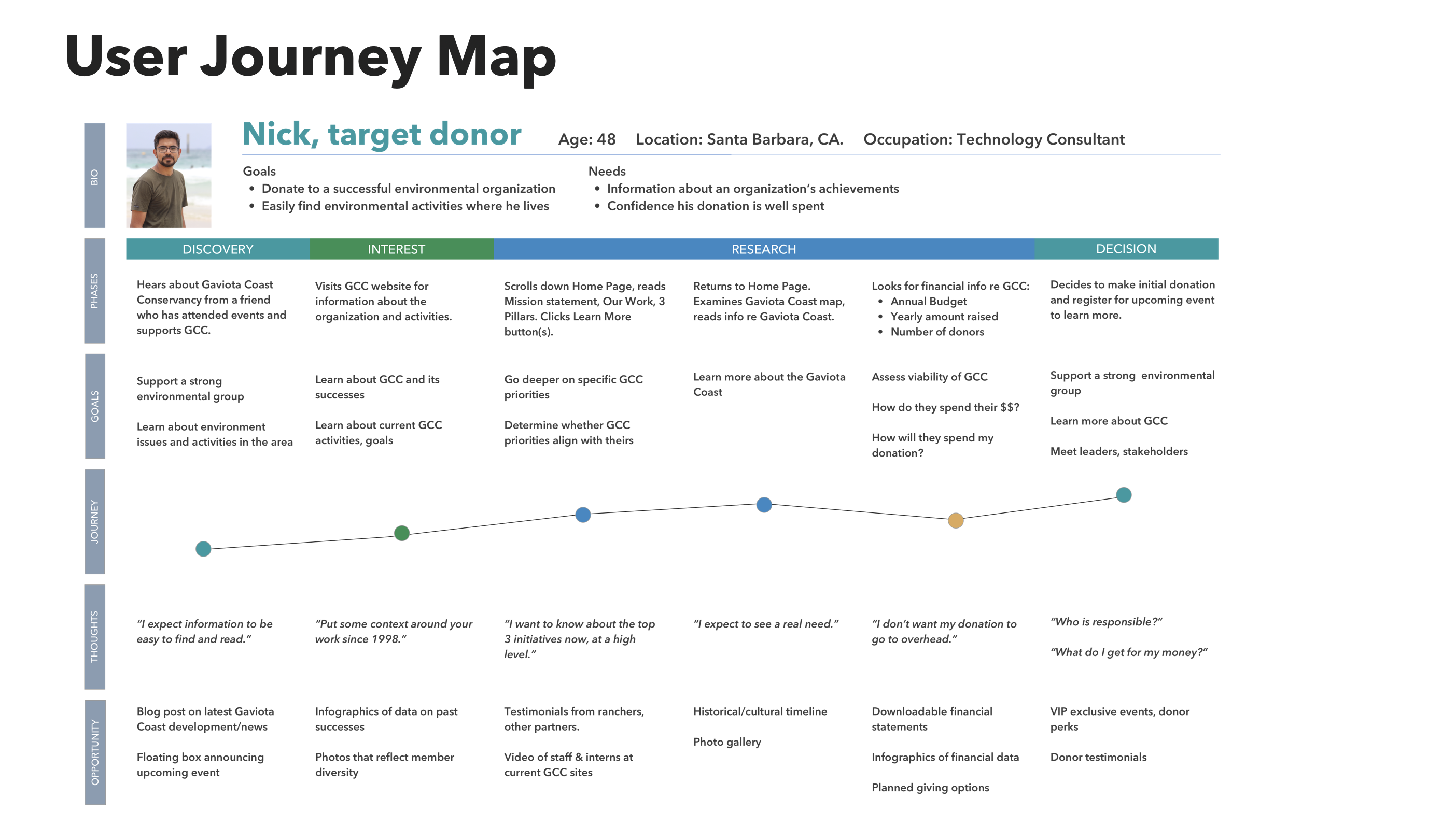
User data was collected from usability tests and interviews of 8 individuals, age 40 - 70+, who lived on or visited the California coast. All had contributed to environmental groups. All preferred simple design and succinct text.
- 6 of 8 wanted to see younger people, more diversity in images.
- 6 of 8 wanted to learn about past achievements.
- 6 of 8 wanted information about the organization’s financial integrity.
- 5 of 8 wanted to learn what GCC is doing now.
- 5 of 8 wanted to know how their donation will be used.
- 4 of 8 wanted information about upcoming events, including hikes.
"I expect information to be easy to find and read."
Clear priorities and trends emerged from the data.
Prototype
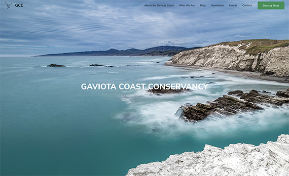
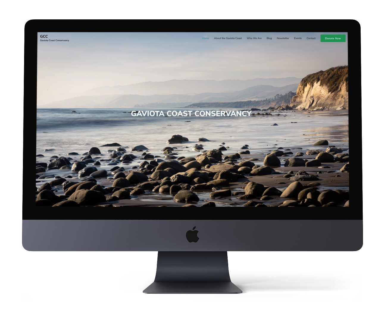
After reporting on my UX research and design, I was asked to complete an initial web design. I researched hosting services, themes, page builders, and plugins, selecting platforms and tools that would be easy to maintain. I then shared this research with staff. I also liaised with photographers and other organizations for new content.
NEXT STEPS
- Add video: donor testimonials, drone footage of Gaviota Coast.
- Replace heron photo with interactive ArcGIS web map for richer context and location.
- Collect data for infographics on achievements and goals.
- Modify animation in story map.
LEARNINGS
Communication and clarity of roles and expectations are critical, especially in remote work.
My training as a digital archivist helped me to respect intellectual property traditions of Indigenous tribal nations.
It also helped me to help stakeholders understand that websites are dynamic spaces that evolve as user needs change and grow.
People care deeply about physical places, moreso as we work remotely. We need to honor those feelings and offer paths to explore new territories.
